In about 1996, I did a sketch for a story I had in mind of "Hell's Nuclear Family" - kind of a parody on traditional family values featuring a stereotypical family; mom, dad, brother, sister and family dog, only reinvented into demonic creatures from Hell. Here's the original sketch:

Not much to look at by today's standards. There's no regard for shadow; rather just random areas of black, no background and the characters are very out of proportion. Obviously back then, I still had quite a lot to learn. Still, I quite like this concept and these are characters I might like to bring into the comic I'm currently working on in my spare time, so I decided I'd recreate the drawing using what I've learned since 1996.
Having scanned the original and taken it into Photoshop (my canvas of choice), here's what I did.
Step 1:
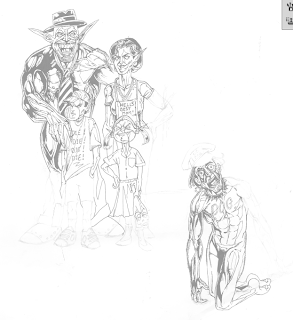
I take the original image's opacity down, effectively turning it into something that looks like a pencil sketch. This makes it easier for me to distinguish between the new image - which will be in a separate layer on top - from the original as I work on it.
Step 2:
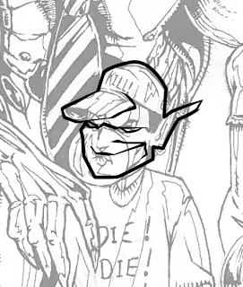
In a new layer, I start reworking each character (I do each individual character on their own separate layer - this makes it easier to ensure that they're placed just right when I'm done). One of the things I really didn't like about the original image was the little boy demon's face. I think he lacked the tongue in cheek feel that the other characters, so here I start turning him into something with a little more character.
Step 3:

One by one I rework the characters, changing their proportions and looks so that they make a little more sense to me from a technical point of view. I've learned quite a lot about anatomy, proportion, foreshortening and all the other boring technical stuff since I first drew this, so bit by bit I tweak the characters, putting all of that into practice.
Step 4:
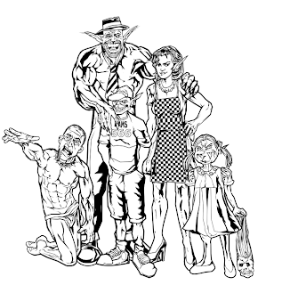
Characters done! With each character drawn on their own layer and filled at the back with white (so that they stand out like cardboard cutouts above any background I put down), I free transform them each one, by one until the proportions and positioning in relation to each other looks just right. Now I'm ready to add a background.
Step 5:
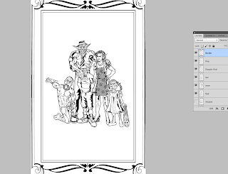
For my background, I start with a kind of "photo frame" border. I kind of see this pic as a warped family photo that would go on a mantlepiece. I went with a minimal deco style border and added a little bat motif just to give it a slightly Hellish flair.
Step 6:
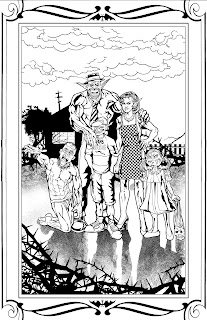
In my final layer, placed underneath the cardboard cutouts of my characters, I go with a background that suggests a slightly messed up version of the classic "white picket fence" family home. I go with an ominous silhouette of a suburban home in the background, a black picket fence and some rather nasty looking vegetation in the foreground and background. I kept the background fairly simple as I didn't want to take too much away from the characters. Silhouettes are very effective from that perspective. The solid black is very powerful and it helps create a slightly darker mood in spite of the simplicity.
And that's pretty much it! Voila! One lousy 90s sketch revamped to be a slightly less lousy 2012 sketch! I think I may use this at some stage as a pin up or a cover - depending on when I can work these characters into my story. Keep watching this space! I'm hoping to post more stuff soon!
